Labeling Laws/FDA and EU Guidance
The reason that many product labels are so difficult to read is that manufacturers are often balancing the need to include required information on the product label with a lack of sufficient real estate on which to print the required information. Many products, and particularly drug products, are packaged in relatively small containers, which limits the size of label that can be used. Thus, in order to provide all required information, the manufacturer is often left with no option but to use very small text which is crowded and often difficult or impossible for most people to read without some form of vision aid.
The FDA and the European Union (EU) have issued various Guidances for Industry for over the counter (OTC) drug products (Labeling OTC Human Drug Products 2008 ), prescription drug products (Safety Considerations for Container Labels and Carton Labeling Design to Minimize Medication Errors 2013 ), medicinal products in the EU (Guideline on the Readability of the Labelling and Package Leaflet of Medicinal Products for Human Use 2009 ), and food and beverages (Food and Drink Labelling: a Practical Guide for Industry 2011 ). In the most recent guidance issued by FDA in 2013 the following background was provided:
Medication errors are a significant public health concern that account for an estimated 7,000 deaths annually in the United States.5 In July 2006, the Institute of Medicine (IOM) published a report titled Preventing Medication Errors. The report cited labeling and packaging issues as the cause of 33 percent of all medication errors and 30 percent of fatalities from medication errors.6 The IOM emphasized that product naming, labeling, and packaging should be designed for the end use, the provider in the clinical environment and/or the consumer.7 More specifically, the report urged FDA to address safety issues related to product labeling and nomenclature using the principles of cognitive and human factors engineering.8
The 2013 guidance for prescription drugs recommends that at least a 12-point font size is used whenever label size permits and that a font is chosen that is easy to read, not light-weight or condensed. Since it is often not possible to fit this size of print in the available space the FDA Guidance also encourages manufacturers to explore unique packaging approaches to address this issue. We believe that IC Optix magnifier label technology provides a unique packaging approach to the problem of label legibility that will improve consumer/patient compliance and safety by reducing the chance of medical error.
The 2008 guidance for OTC products recommends at least an 8-pt font be used for Drug Facts and a 6-pt font for subheadings. This size of text is not legible to most of the population without the use of a vision aid. It is very common to see the following type of label on OTC products – most people can’t read this very important box without a vision aid!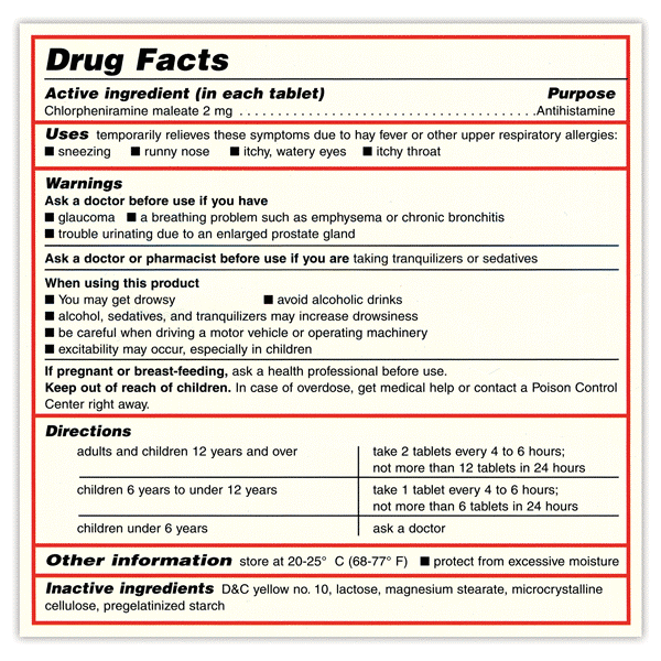
The examples shown below illustrate the magnifier label as it would appear on a product prior to use (left) and during use (right) after peeling and lifting above the surface of the label. By adjusting the distance of the lens from the surface of the label the text can be magnified to a greater or lesser degree.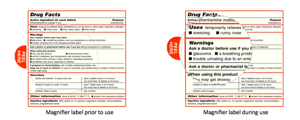
The magnifier technology can be readily integrated into the conventional label manufacturing process to be a surface peel layer of the primary product label. Alternatively, the magnifier technology can be integrated into a completely transparent label that can be used to over label the existing primary product label.
References:
1) FDA Guidance to Industry: Labeling OTC Human Drug Products 2008
2) FDA Guidance to Industry: Safety Considerations for Container Labels and Carton Labeling Design to Minimize Medication Errors 2013
3) Preventing Medication Errors: Institute of Medicine Quality Chasm Series. Washington, DC: The National Academies Press, 2007 http://www.nap.edu/catalog.php?record_id=11623